Year

2021

Industry

B2B Startup

Services

Rebranding, Web design, Swag, Decks

Highlights
Highlight illustration

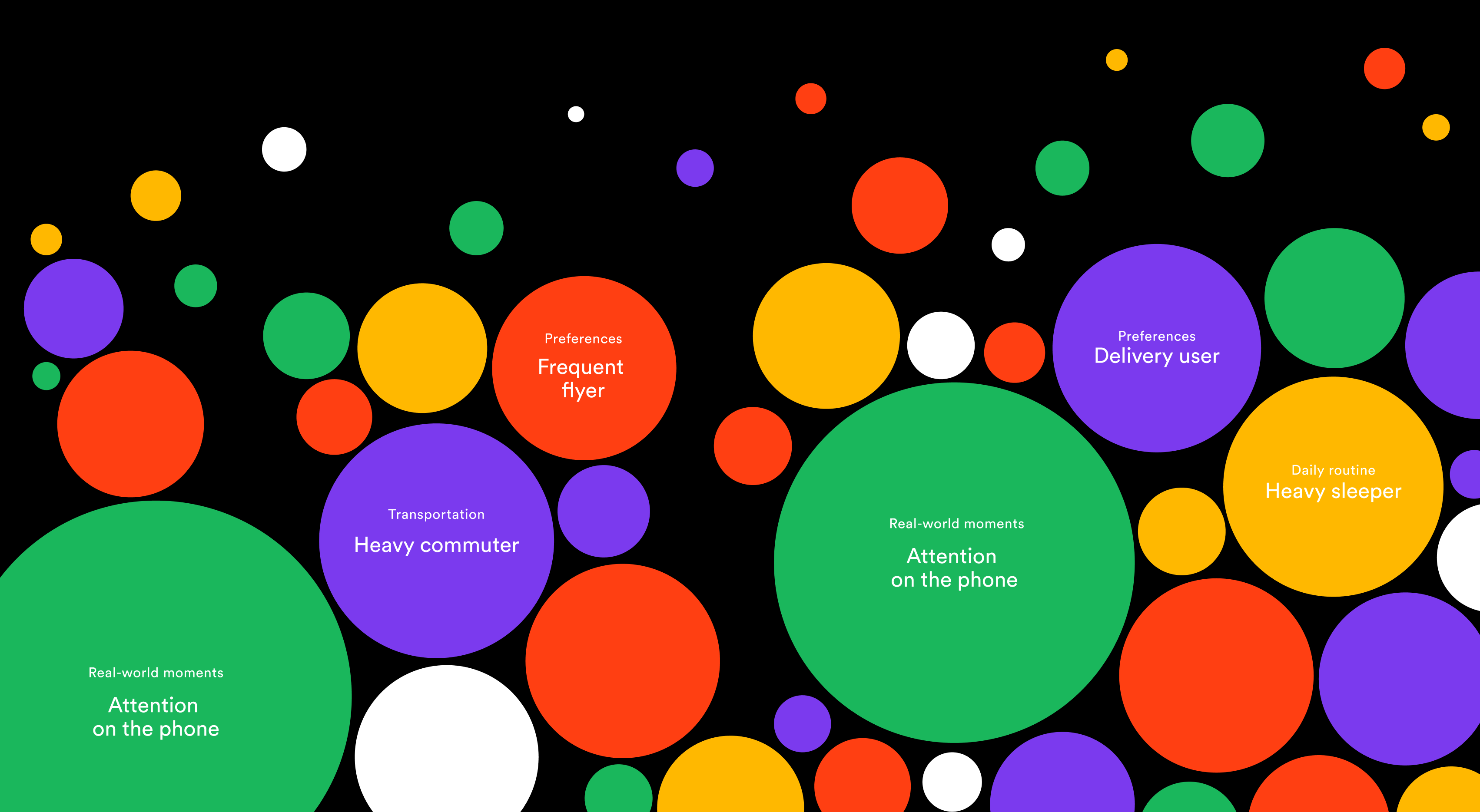
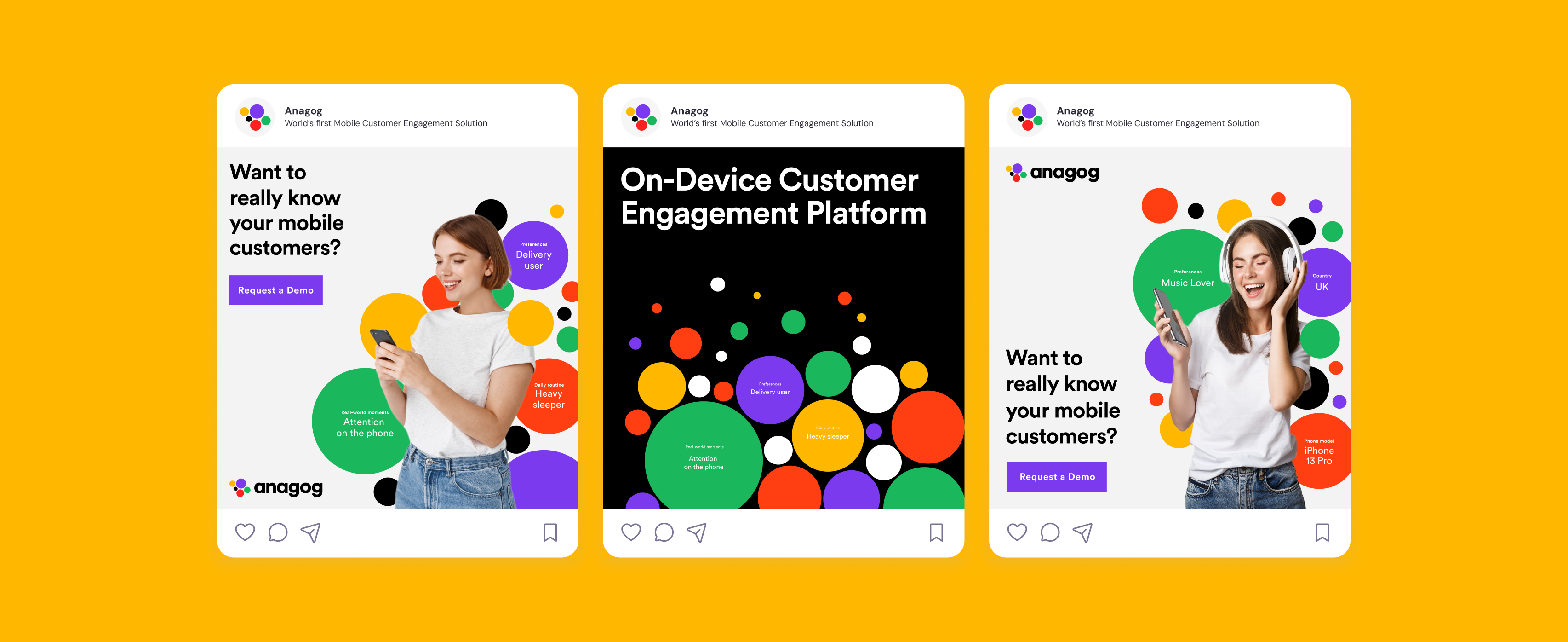
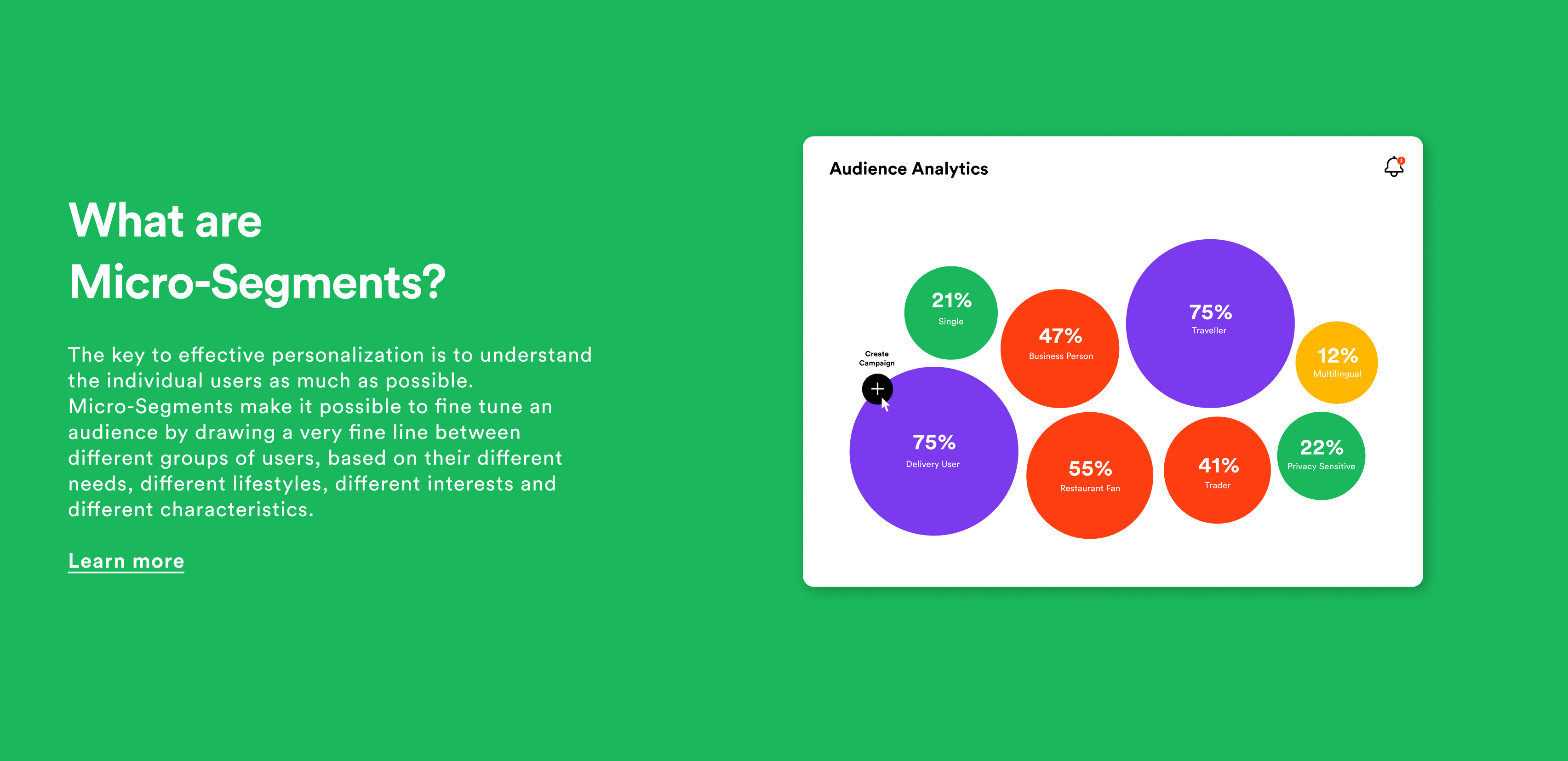
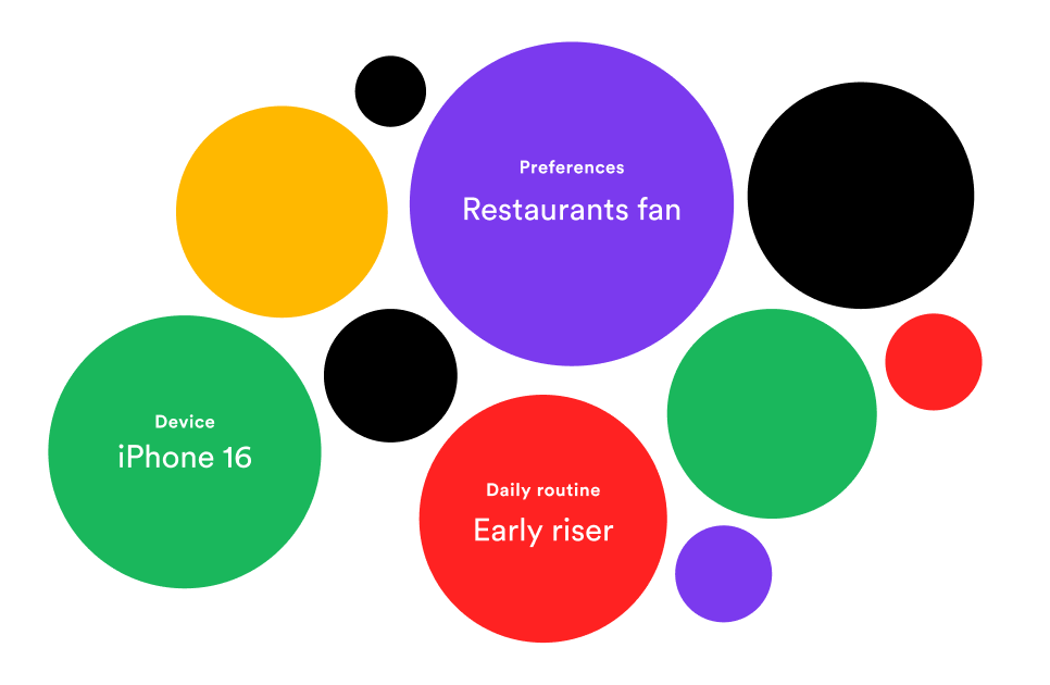
Turning Overloaded Metadata into Clean Design

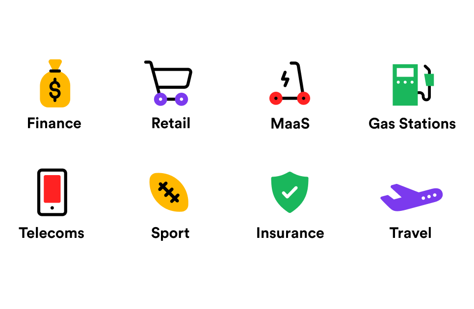
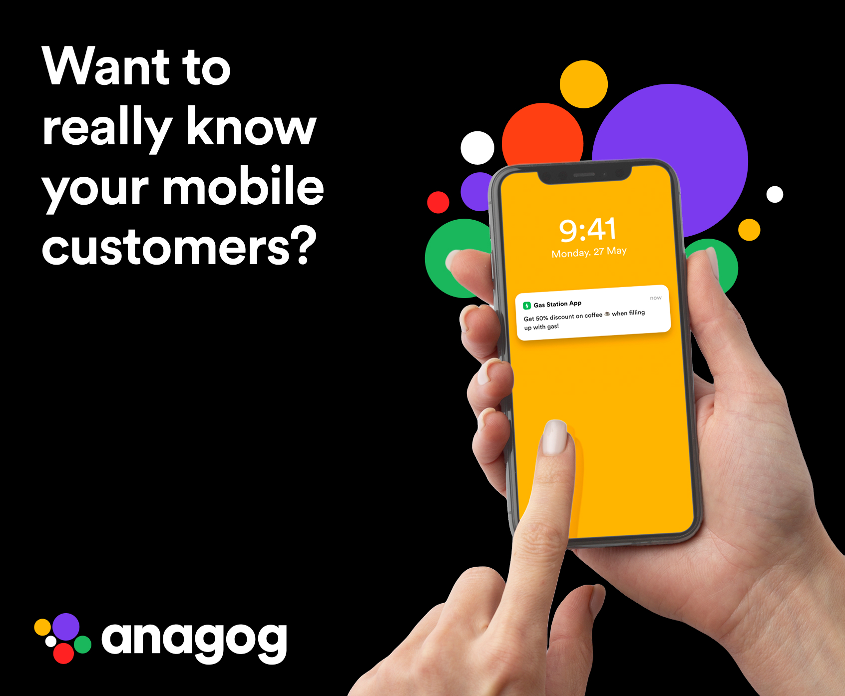
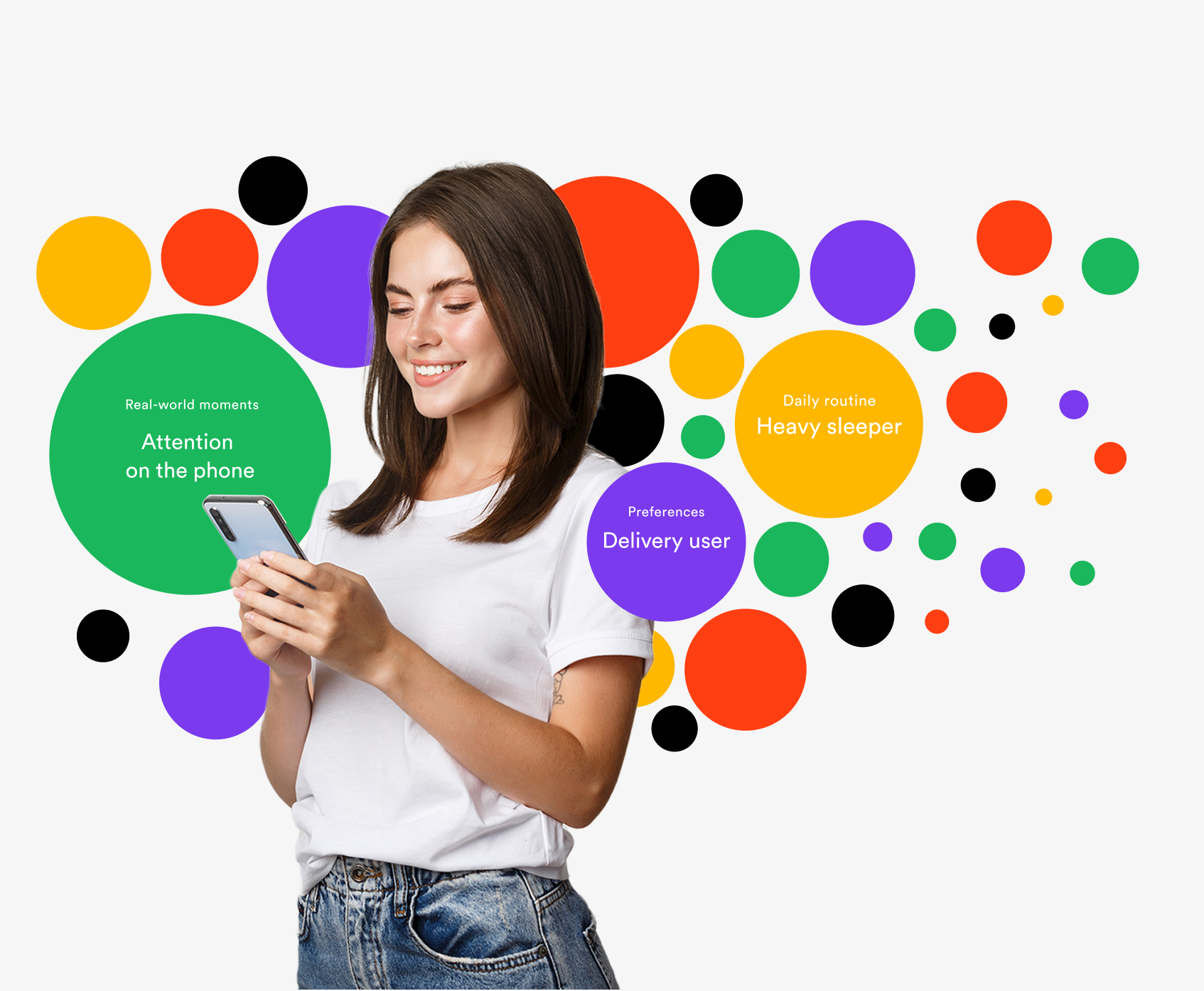
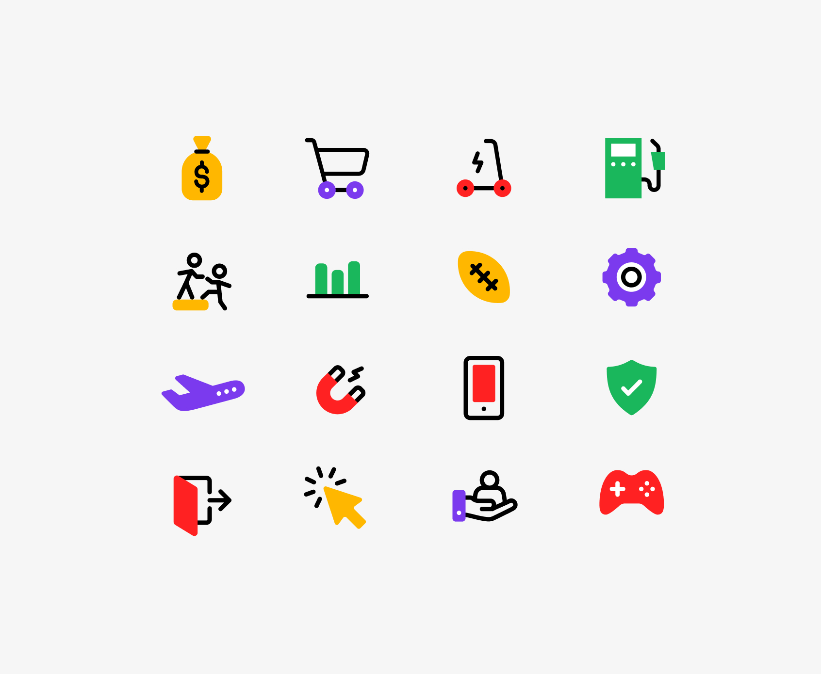
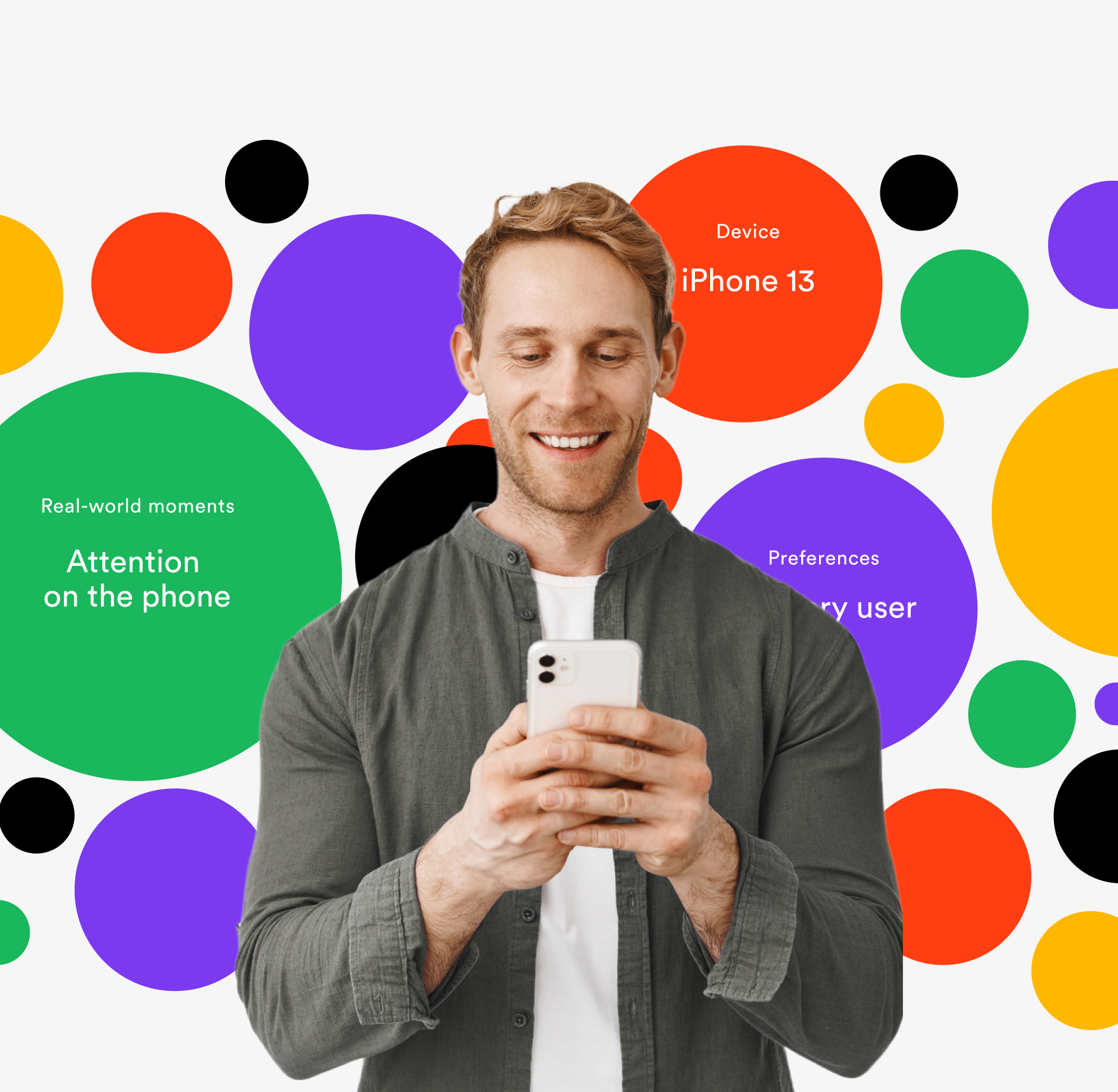
Anagog works with massive amounts of on-device user data. The challenge was to turn noisy, overloaded metadata into a clear visual system. We designed data bubbles that surface contextual signals per moment, using density and hierarchy to suggest scale while keeping the experience clean and readable. The same logic carries into the logo itself, which acts as a minimal, distilled version of the data bubbles at the core of the brand.

Highlight character system

Many Industries, One System

Anagog operates across a wide range of industries, from mobility and retail to finance and gaming. The challenge was to express this range without chaos. We designed a custom icon system where each industry has its own character, while sharing a common structure, black outlines, and the brand's color palette. The result communicates diversity and focus at the same time, allowing the brand to scale across industries without losing coherence or distinction.

Highlight interface overview

Real Moments, Not Stock: Defining the Photographic Language

The challenge was to introduce human visuals that feel natural and credible without relying on studio shoots or heavy production. We curated visuals that capture real, everyday moments, avoiding the polished stock look while maintaining consistency, warmth, and relevance to the brand.

Clarity Is the Product

Anagog operates in an environment where data overload is the norm. This project focused on turning dense metadata and multi-industry complexity into a clear, coherent brand system that communicates control, precision, and scale.

Thanks

Marketing Strategy & Execution: Maya Dror Melamed

Development: Tabuzzco

EXPLORE MORE

Let's move forward

Drop us a line, and we'll take it from there.